Business benefit
How Gusto helped the GCC's leading matcha brand unify its packaging and identity


What we do
We refreshed their logo and identity, created packaging concepts, and built a look designed to connect with a young, trend-driven GCC audience.
Our goals
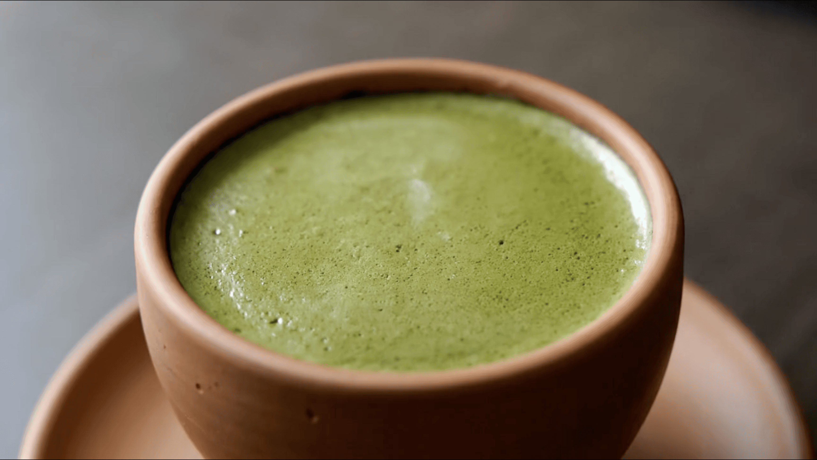
Yoocha had grown fast but the packaging hadn't kept up. Different product lines had slightly different designs, different label layouts, different visual treatments. It worked when they were small, but as they expanded into B2C retail and prepared to launch new flavors, the inconsistency started working against them.
We unified everything into one cohesive system - new logo, refined color palette, consistent typography and layout rules that scale across sachets, bottles, boxes, and cups. Two creative directions were developed and presented:
• Direction 1: "A little whisking, a lot less chaos" - clean, minimal, product-forward
• Direction 2: "Open for a bold green start" - expressive, lifestyle-driven, bolder typography


Branding
We refreshed the logo, built a trilingual identity system - English, Japanese, Arabic - and created packaging concepts designed to unify the product range across the GCC.


Our goals
The second direction leaned into lifestyle and energy. Warmer, more expressive, built around the idea of matcha as a social ritual - not just a health product. Bolder typography, lifestyle photography, a tone that speaks to a younger GCC audience who wants their matcha to look as good as it tastes.


Branding
We unified their product range under one visual system - from logo and trilingual identity to packaging that works across every format and flavour.


Our goals
We designed Yoocha's exhibition stand and branded materials for trade shows across the GCC. The stand brought the new identity to life at scale - bold green and white palette, clean product hierarchy, and a layout that drew foot traffic and converted it into B2B conversations.
Branding
The goal: one brand, one look, everywhere it shows up.


Our goals
We unified the visual system across all formats - sachets, tins, bottles - refreshed the logo with a trilingual identity (English, Japanese, Arabic), developed two creative directions for the rebrand, and extended the new look into exhibition stands and branded merch. One brand, one system, ready to scale.
Clients review
The brand feels fresh, clean, and truly aligned with Yoocha Matcha. We love the result.

Anahit
Marketing Manager
More cases: